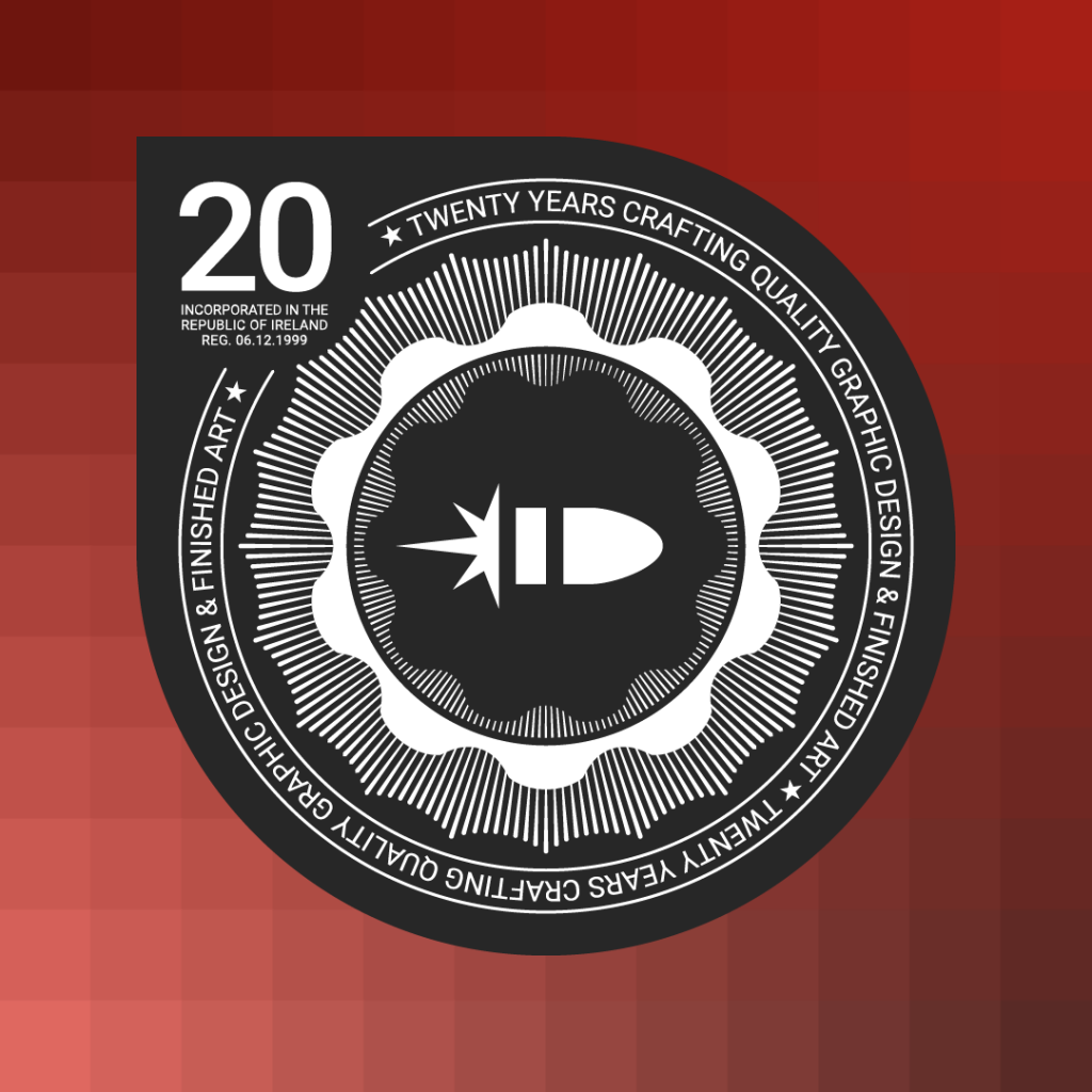
The 20th anniversary graphic

Twenty Years Crafting Quality Graphic Design & Finished Art.
Sharpshooter is celebrating 20 years in business throughout 2020. This graphic takes pride of place on the new company website to celebrate the milestone.
The graphic is designed to be reminiscent of a military badge, with the company’s logo icon (also called a logo mark) at the centre. The stylised bullet has been Sharpshooter’s logo since the very beginning and, apart from a little refining of the shape, hasn’t changed in the intervening time. It’s a simple but effective logo encapsulating everything I wanted it to represent: clean and effective design, speed and accuracy.
As for colour, red was the obvious choice and it has also stayed pretty much the same for the past 20 years. Not only is it a striking colour, it also ties in very well with the design influences behind the logo: graphic design of the Dutch De Stijl and Russian Constructivism art movements. Do a Google image search for either plus ‘graphic design’ and you’ll see how elements of each movement inspired and influenced the logo design.